Coached an 8-person design team; ad conversion rose 12% after the redesign
- Role
- Design Team Coach and Manager
- Team
- A design team of 8, UX researchers included, as one of 2 Design Team Managers; worked with front end and the short-term revenue squad
- Scope
- B2C sports app · iOS and responsive web · navigation, ad experience, a prediction game, web design system
- Context
- Live-scores app for 800+ football leagues and cups, with over 3 million weekly users at the time
- +12%
ad conversion (clicks on ads, relative), in the first 3 months of the new More tab, against the 3 months before
- 8
people coached in the design team, with a shared workflow and toolbox
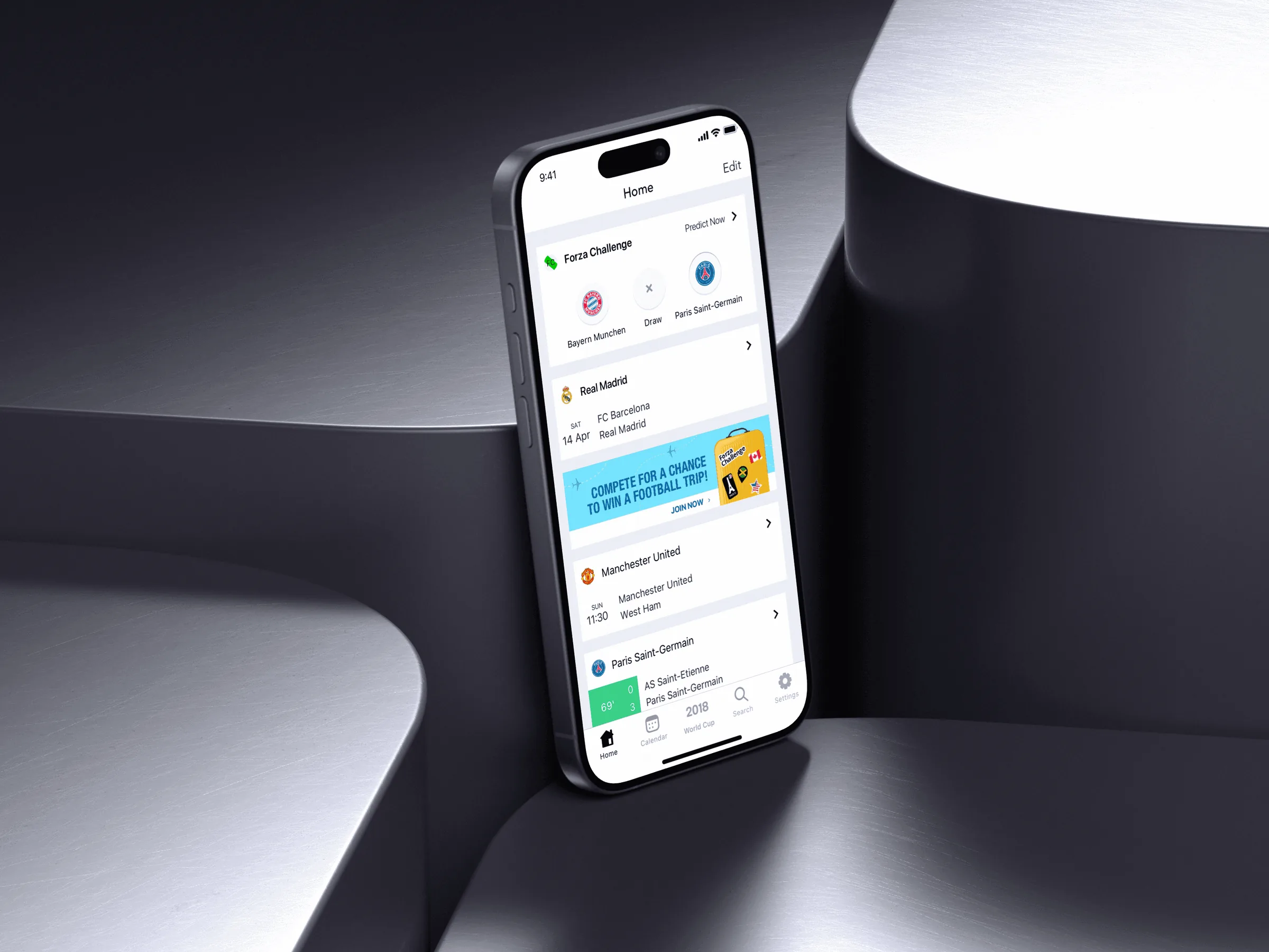
A Settings tab that had become the place for everything
Forza Football's live-scores iOS app was the company's main product, with over 3 million weekly users. Over 3 years of growth, its Settings tab had filled up with settings, personalization, ads, news and more. Support contacts and our usability research showed that users were confused by it. Ads in the app also brought in revenue. So the question was how to make the tab easier to use and still give ads a place that worked.
My role had 3 parts: coach a design team of 8, design ad campaigns for the short-term revenue squad and improve the iOS app's information architecture and ad experience.
Settings became More, with room to grow and a shortcut to ads
I redesigned the tab's information architecture. I regrouped its content, made the copy clearer and added more personalization options. I also added a shortcut to full-screen ad spaces and renamed the tab from Settings to More: "Settings" boxed the tab in, while "More" left room for future features. The calculated risk was putting ads next to the settings.
Ad conversion, counted as clicks on ads, rose 12% (relative) in the first 3 months, compared with the 3 months before. There was no control group, so the rise belongs to the whole change, including the ad shortcut, not to the new name alone. It shows that the new tab worked for ads. It doesn't show that fans found things faster.
It is the one number from this work. Forza Challenge and Riquelme have no figures; their evidence is what they became.
Coaching a team of 8, and setting up how it worked
I was one of 2 Design Team Managers, and I coached a design team of 8, UX researchers included. I didn't hire or promote anyone at Forza. My work was to grow the people on the team:
- People. I helped team members find their passion, built trust between them and supported their personal, technical and professional growth. I agreed one growth goal with each person and reviewed it with them every month.
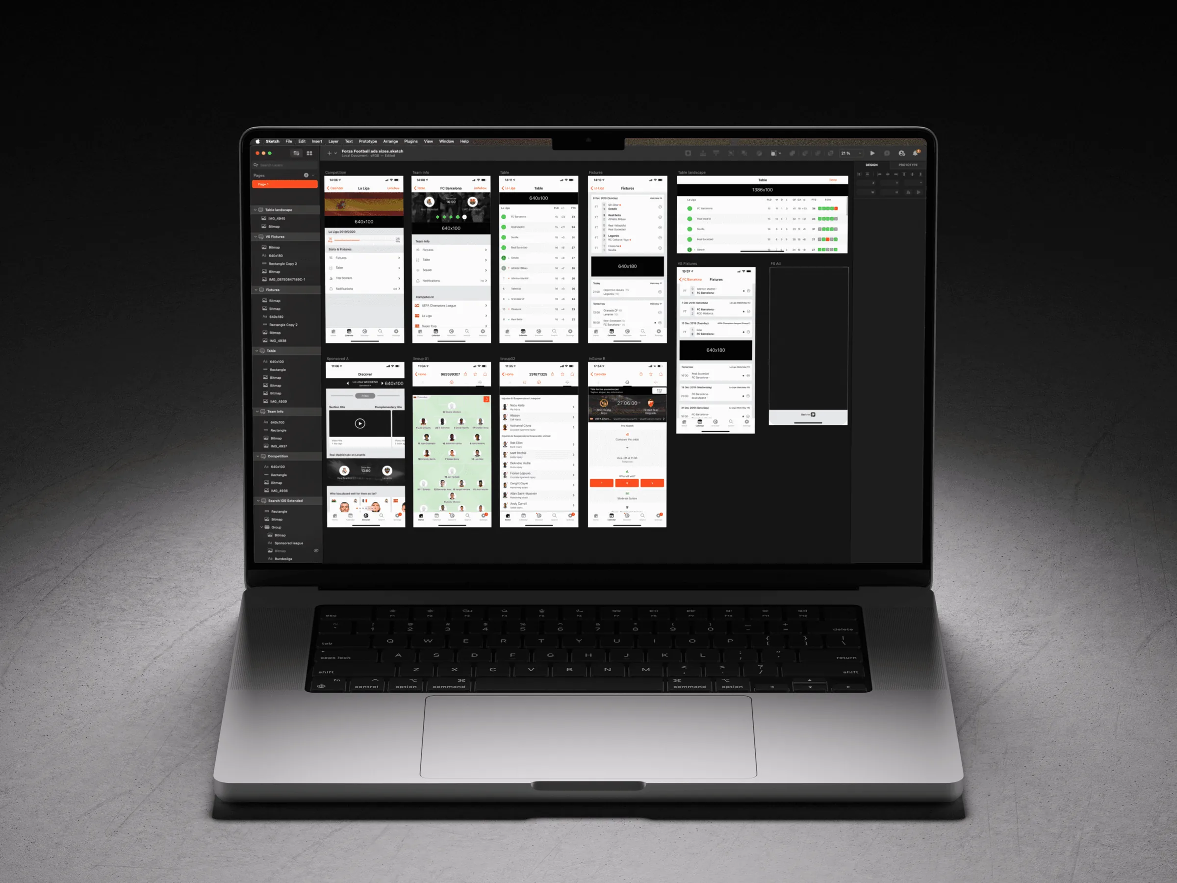
- Ways of working. I defined the team's workflow and a shared toolbox, and started DesignOps: regular critiques and design reviews.
- Hands-on. I designed over 30 international ad campaigns for the short-term revenue squad.
“Alvaro is great not only as a coach but also as a designer, his listening and his questioning skills are sharp!” João Paulo Villa Mello, former Design Manager, Forza Football
“As my coach, he was always there for me and I would recommend him for anyone who wants a real team player. He has a good balance of technical and people skills.” Sofia Andersson, UX Researcher, Forza Football
“Alvaro has a managerial style based on honesty, trust and care. He goes above and beyond to make sure his team members have what they need to perform and develop.” Sebastian Fürle, former Front End Manager, Forza Football
Forza Challenge: a prediction game tested as an alternative to ads
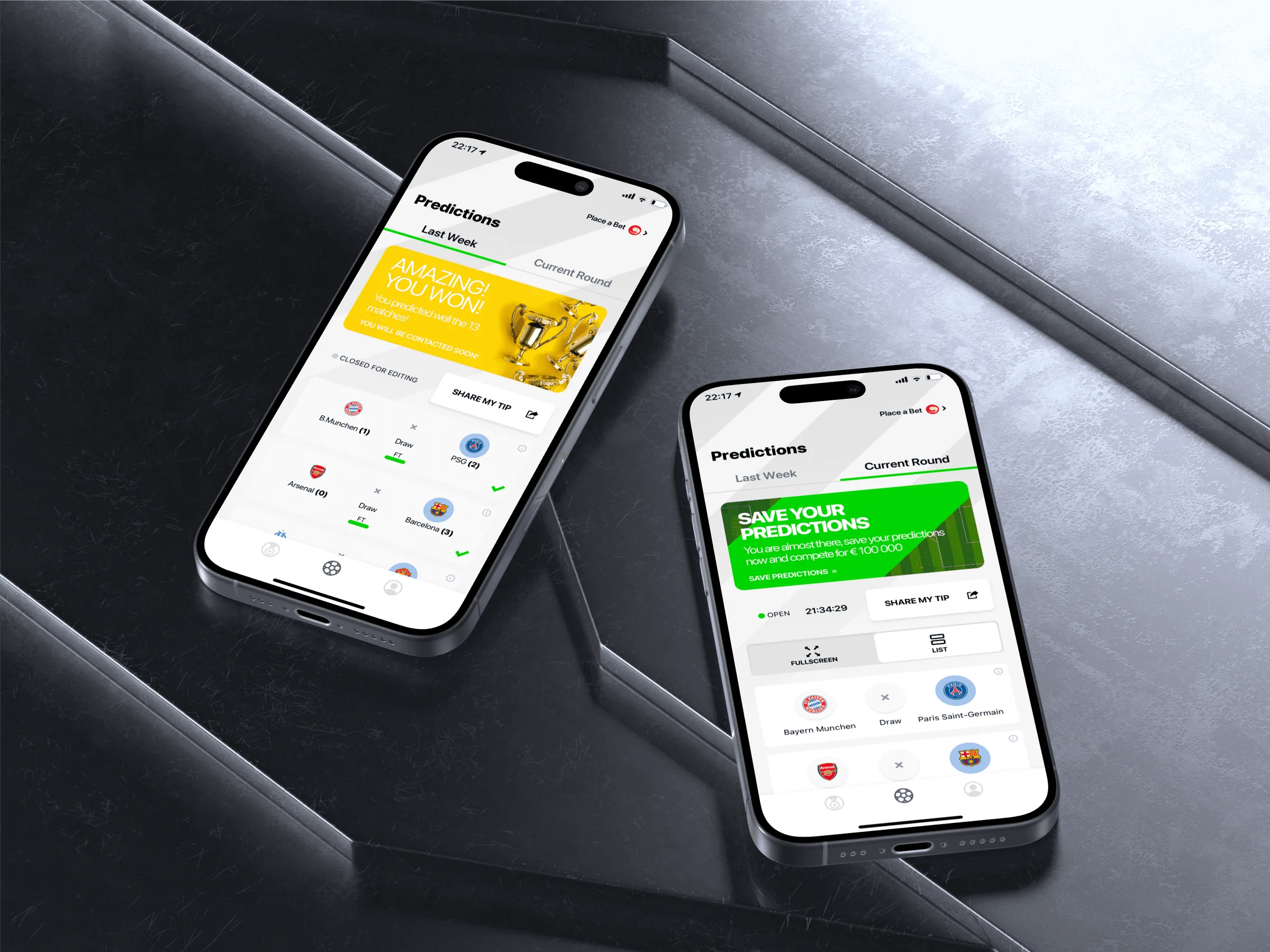
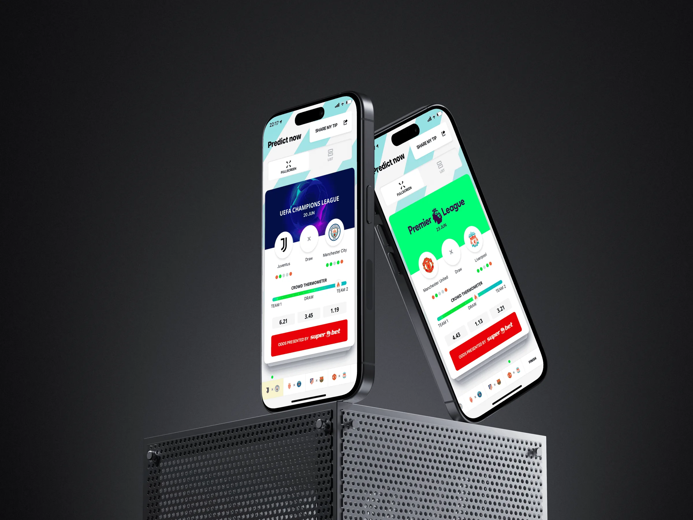
Forza Challenge was an experiment in connecting fans and their friends through live scores and friendly bets. I led it and did key parts of the design myself. Its prediction view borrowed well-known betting concepts, so each match or league could carry a betting partner's sponsorship.
We piloted it with test groups. Parts of it, the predictions and the sponsorship slots, then went into the main app, where it served as an alternative to traditional ads, another way to fund the app.
Riquelme: the responsive web app, built from one design system
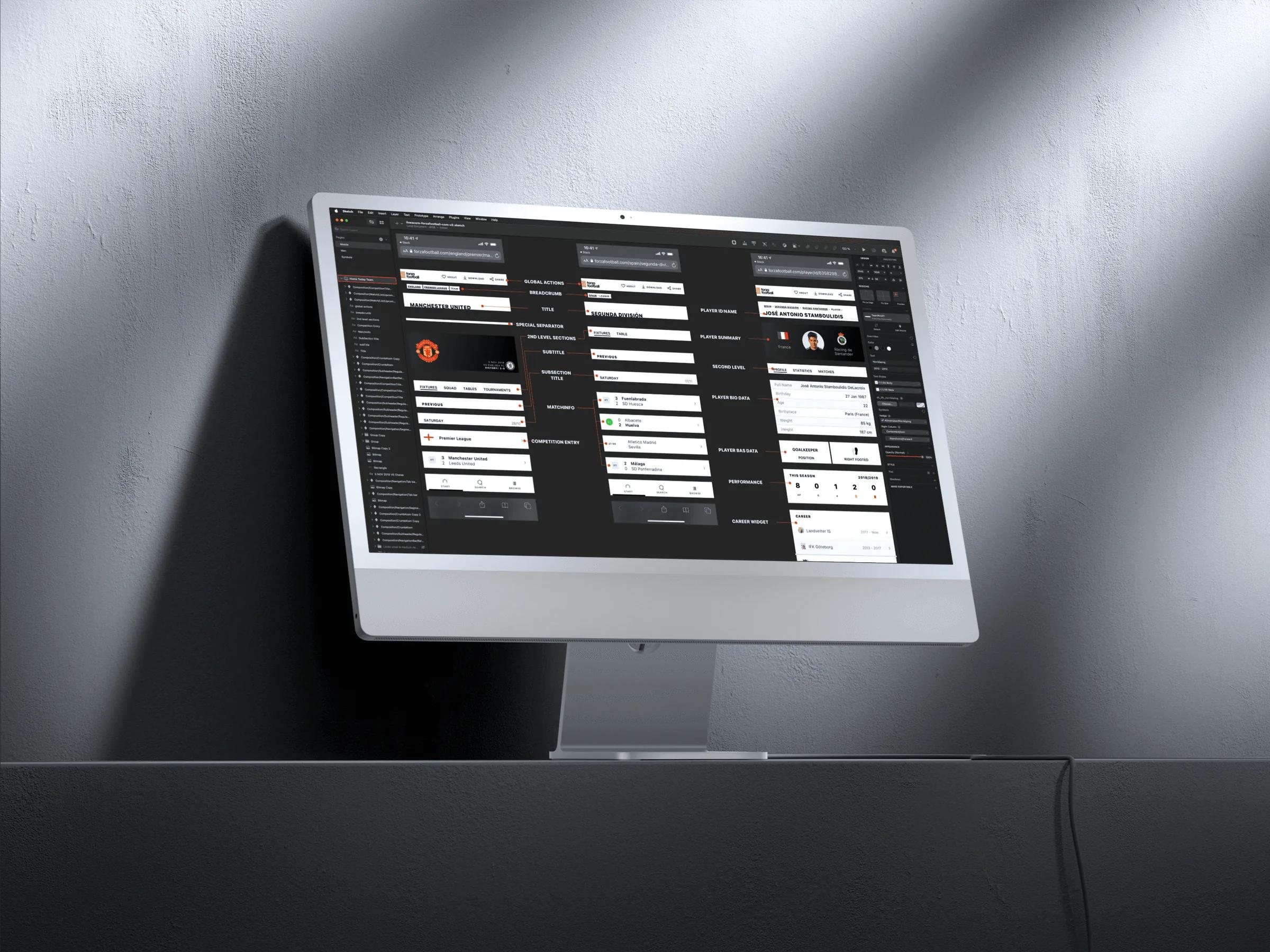
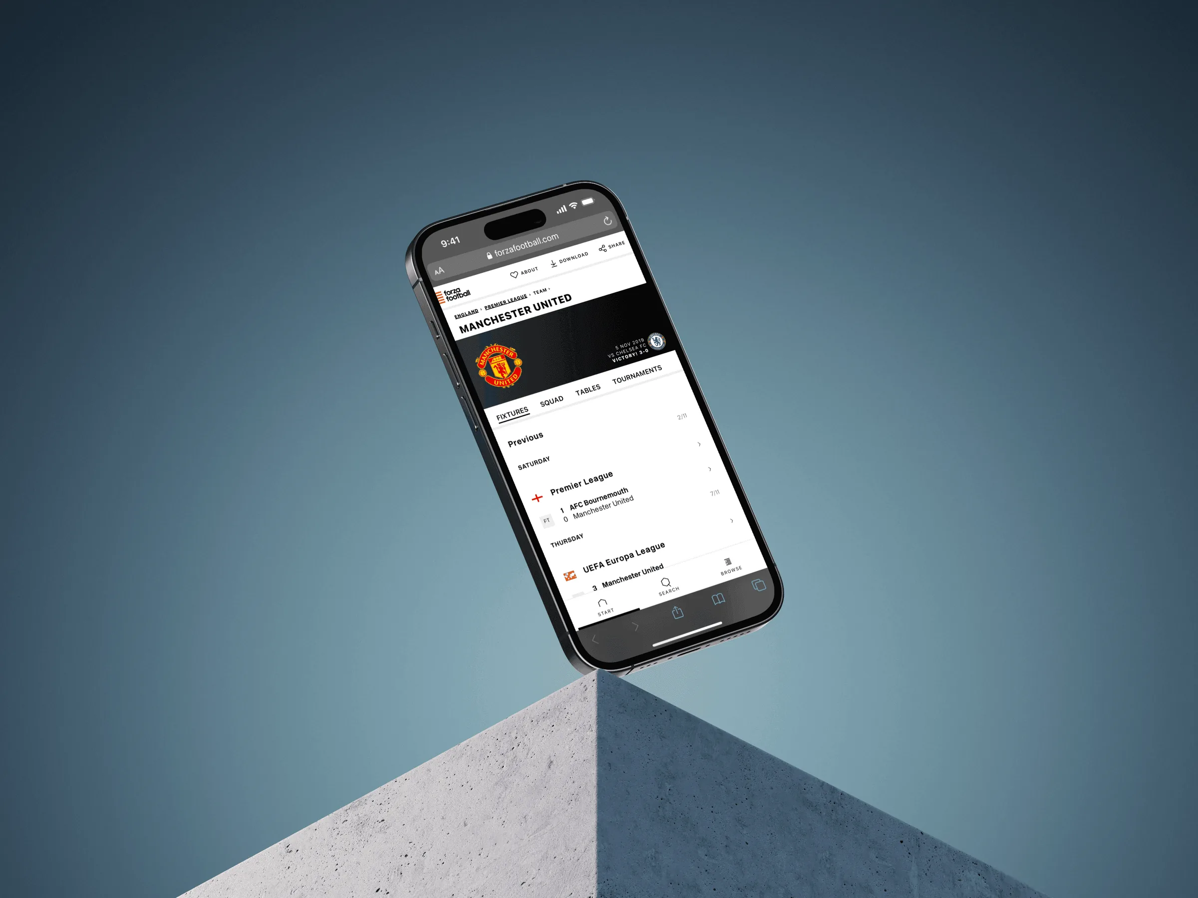
I designed the web side of Riquelme, Forza's design system. Another designer designed its iOS side, and developers built it. It lived in Sketch and Abstract, because Forza didn't use Figma at the time. The responsive web version of the live-scores app was built from it: the Team Detail view, for example, used only Riquelme components.
What I'd do differently
I'd add a task test before and after the More tab, to see whether fans found things faster. I'd plan Riquelme's web and iOS sides as one system from the start, not 2 efforts by 2 designers. And the monthly growth goals I started at Forza are something I still do as a lead.
Credits: another designer on Riquelme's iOS side, the developers who built it and the designers and UX researchers on the team.